Align DateTimePicker width in Form

Hi Team,

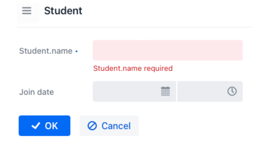
When adding dateTimePicker in Form, it’s width can’t be aligned in the form:
image

It shows the dateTimePicker exceeds its parent formItem in the browser inspector:
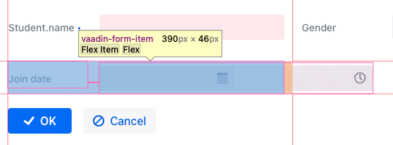
image

Could you please help check how to fix it now?

Jmix version: 2.1.2
Jmix Studio plugin version: 2.1.2-233
IntelliJ version: IntelliJ IDEA 2023.3.3 (Ultimate Edition)

Hi Bryan,

This is a known issue in Vaadin. You can follow it here: DateTimePicker doesn't fit nicely in a FormLayout with labels set on the side · Issue #5074 · vaadin/web-components · GitHub

As a workaround, you can use ResponsiveSteps with a larger minWidth value so that the dateTimePicker doesn’t exceed its parent.

        <formLayout id="form" dataContainer="studentDc" alignSelf="STRETCH">
            ...
            <responsiveSteps>
                <responsiveStep minWidth="500px" columns="1" labelsPosition="ASIDE"/>
                <responsiveStep minWidth="1100px" columns="2" labelsPosition="ASIDE"/>
                <responsiveStep minWidth="1600px" columns="3" labelsPosition="ASIDE"/>
            </responsiveSteps>
        </formLayout>

изображение
изображение

Also you can switch to labelsPosition="TOP" which is not affected by this issue.

Regards,
Sergey.

Thanks @fedorov for the solution!

According to this GitHub reply, now we have the workaround:

  1. set max width of DateTimePicker to 100% using Java or css, for example, in css:

    vaadin-date-time-picker{
        max-width: 100%;
    }
    
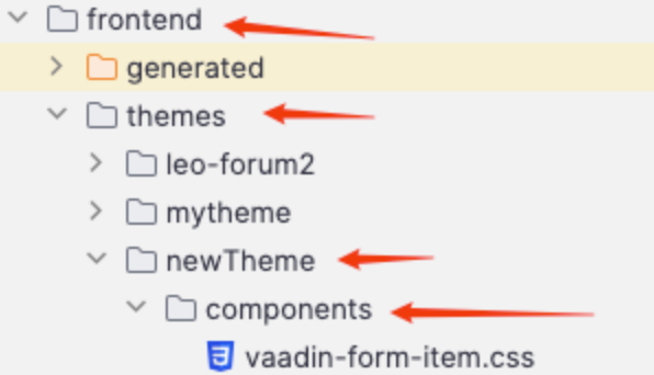
  2. add components/vaadin-form-item.css in frontend/themes/<Your theme name> folder:

    image

    with below content:

    #content{
        min-width: 0;
    }
    

result:
image