Hi
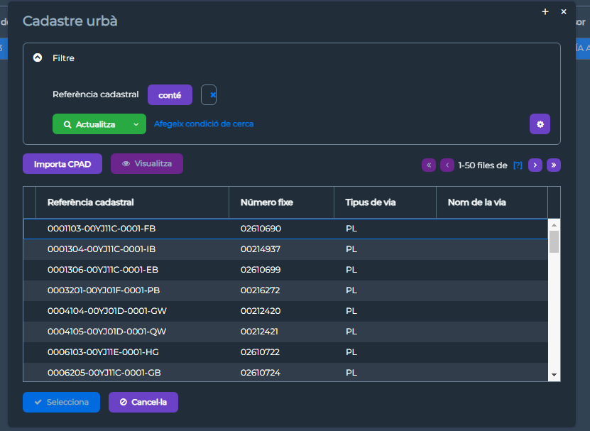
We have a problem with master-detail screen. When users try to add a filter condition to search for a String, the input field gets shrink and hide input text. This is pretty problematic to our users. They cannot use the filter at all.
We have changed columnCount to 1 but we still have same problem.
Jmix version 1.5.3

Hi!
This is not a bug, this is standard behavior. There is a corresponding discussion on GitHub:
Interval filter conditions look ugly · Issue #436 · jmix-framework/jmix · GitHub.
The columnsCount attribute should be used in case of limited space (e.g. in master-detail screen) in order to provide more space for condition fields. By default
columnsCount= 3 which is suitable for a standard browser screen.
Is columnsCount solve your problem?
Regards,
Dmitrity
When we set the columnsCount to 10 the result is the same. What’s happen ?

Thanks,
Maybe it will be useful.
Try adding this:
    <dialogMode height="80%"
                width="80%"/>
This change will make the window wider.
Problem solved,
Thnxs