Create a new project , add a screen and a button… under style name add “warning”
I don’t see the yellow color applied from the helium template in Cuba. Am I missing something?
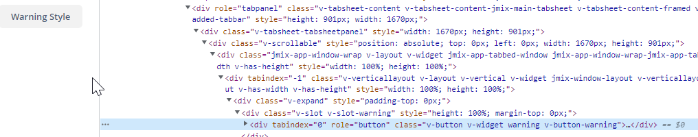

Create a new project , add a screen and a button… under style name add “warning”
I don’t see the yellow color applied from the helium template in Cuba. Am I missing something?
Hi,
there is no predefined warning style for buttons, only for notifications. For buttons we have primary, friendly and danger (see demo).
Regards,
Gleb
You are correct !!! I am imagining things… How can I make the button yellow?
You can implement custom warning style, e.g.:
@mixin helium-ext {
  @include helium;

  --button-warning-color: var(--warning-color);
  --button-warning-text-color: var(--warning-contrast-text-color);
  --button-warning-hover-color: #ffca40;
  --button-warning-active-color: #ffba08;
  --button-warning-disabled-color: #ffe5a1;
  --button-warning-disabled-text-color: var(--warning-contrast-text-color);
  --button-warning-focused-border-color: var(--button-warning-disabled-color);

  .v-button-warning {
    @include he-button-color-style(
            $main-color: --button-warning-color,
            $text-color: --button-warning-text-color,
            $hover-color: --button-warning-hover-color,
            $active-color: --button-warning-active-color,
            $disabled-color: --button-warning-disabled-color,
            $disabled-text-color: --button-warning-disabled-text-color,
            $focused-border-color: --button-warning-focused-border-color
    );
  }
}
<button caption="Button" stylename="warning"/>
Regards,
Gleb