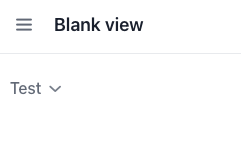
I want to place the accordion toggle after the summaryText, like this example below, and when it’s expanded, the toggle should remain right after the header. I tried using theme=“reverse” from the Vaadin documentation, but when it’s opened, the toggle moves to the very end, which doesn’t look good.
Hi!
If the predefined themes don’t suit you, you can create your own according to the Vaadin documentation: Styling | Accordion | Components | Vaadin Docs
For example, you can set the my-reverse
theme in the XML descriptor:
<accordion width="100%">
<accordionPanel summaryText="Test" themeNames="my-reverse"/>
</accordion>
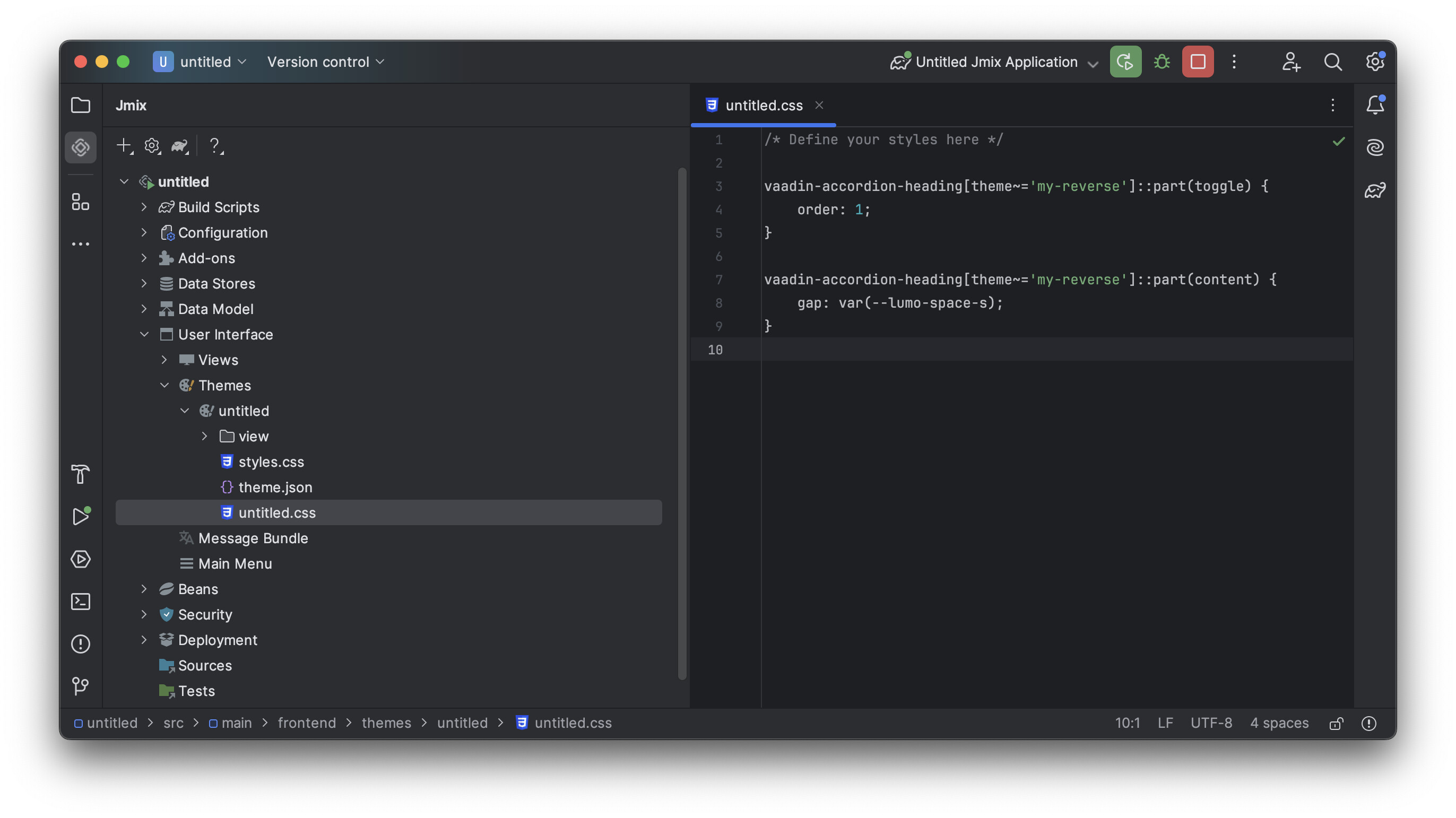
Next, it remains to define the theme in the CSS file of your application theme:
vaadin-accordion-heading[theme~='my-reverse']::part(toggle) {
order: 1;
}
vaadin-accordion-heading[theme~='my-reverse']::part(content) {
gap: var(--lumo-space-s);
}
Result:
Best regards,
Dmitriy
1 Like
ok, thank you!