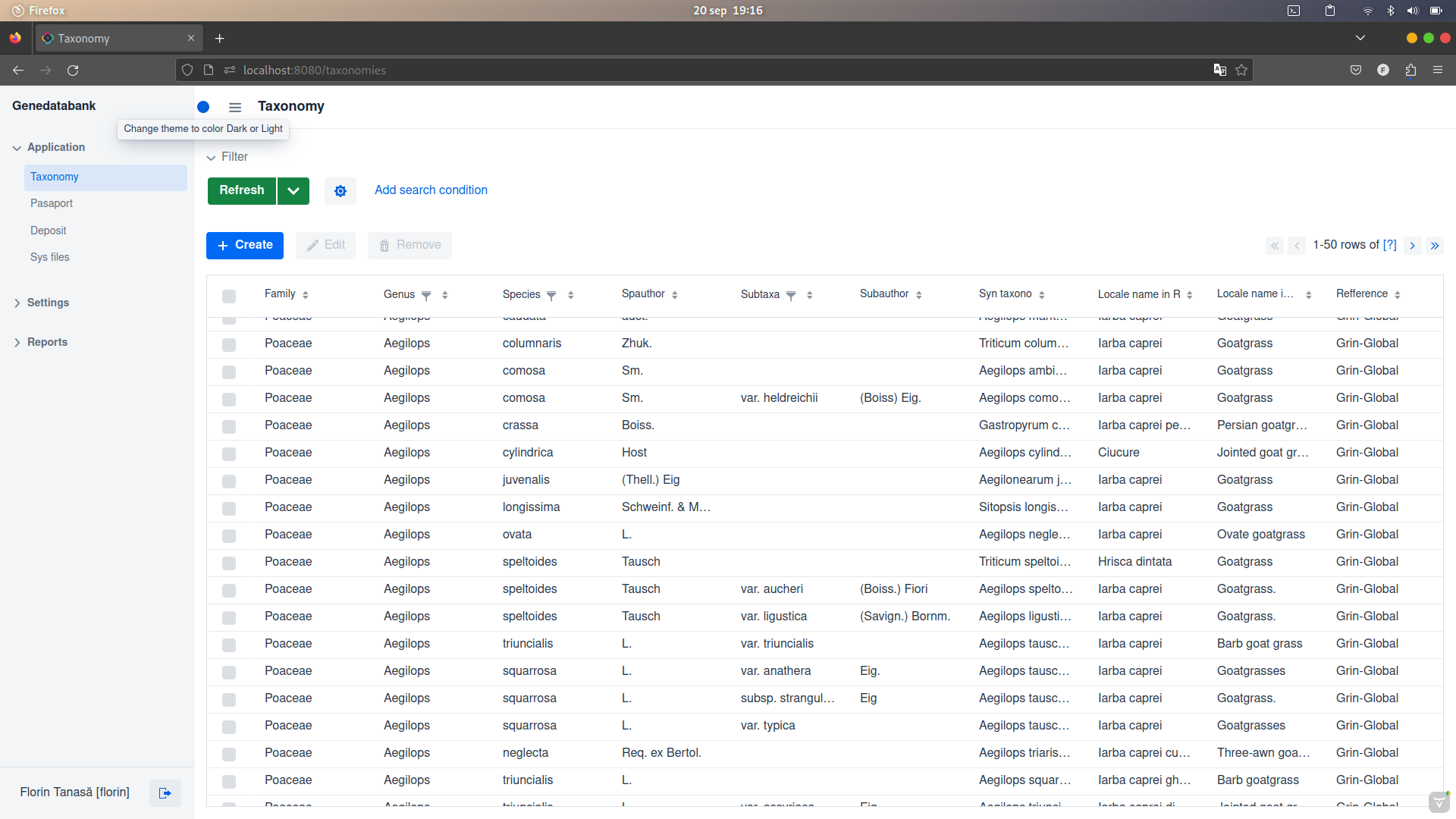
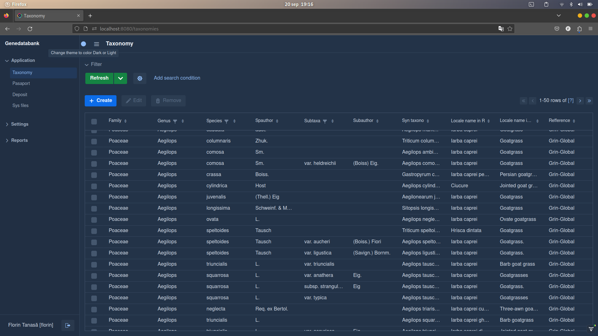
Hi,https://demo.jmix.io/ui-samples/ for this task, now I use full circle themeButton.setIcon(VaadinIcon.CIRCLE.create());;
package com.genebank.genedatabank.view.main;

import com.vaadin.flow.component.UI;
import com.vaadin.flow.component.button.ButtonVariant;
import com.vaadin.flow.component.html.Header;
import com.vaadin.flow.component.icon.VaadinIcon;
import com.vaadin.flow.dom.ThemeList;
import com.vaadin.flow.router.Route;
import com.vaadin.flow.theme.lumo.Lumo;
import io.jmix.flowui.UiComponents;
import io.jmix.flowui.app.main.StandardMainView;
import io.jmix.flowui.kit.component.button.JmixButton;
import io.jmix.flowui.view.*;
import org.springframework.beans.factory.annotation.Autowired;

@Route("")
@ViewController("MainView")
@ViewDescriptor("main-view.xml")
public class MainView extends StandardMainView {
    @Autowired
    private UiComponents uiComponents;
    @ViewComponent
    private MessageBundle messageBundle;
    @ViewComponent
    private Header header;

    @Subscribe
    public void onInit(final InitEvent event) {
        initManualThemeChange();
    }

    protected void initManualThemeChange() {
        JmixButton themeChangeButton = createThemeButton();
        themeChangeButton.addClickListener(e -> {
            ThemeList themeList = UI.getCurrent().getElement().getThemeList();
            if (themeList.contains(Lumo.DARK)) {
                themeList.remove(Lumo.DARK);
            } else {
                themeList.add(Lumo.DARK);
            }
        });
        header.addComponentAsFirst(themeChangeButton);
    }

    protected JmixButton createThemeButton() {
        JmixButton themeButton = uiComponents.create(JmixButton.class);
        themeButton.setIcon(VaadinIcon.CIRCLE.create());
        themeButton.addThemeVariants(ButtonVariant.LUMO_ICON, ButtonVariant.LUMO_TERTIARY_INLINE);
        String toolTipThemeButton = messageBundle.getMessage("toolTipThemeButtonMessage");
        themeButton.setTooltipText(toolTipThemeButton);

        return themeButton;
    }
}
Light
Dark
gorelov
September 20, 2024, 6:21pm
2
Hi,
The code of the ThemeToggle component used in the UI Samples app can be found in the corresponding sample .
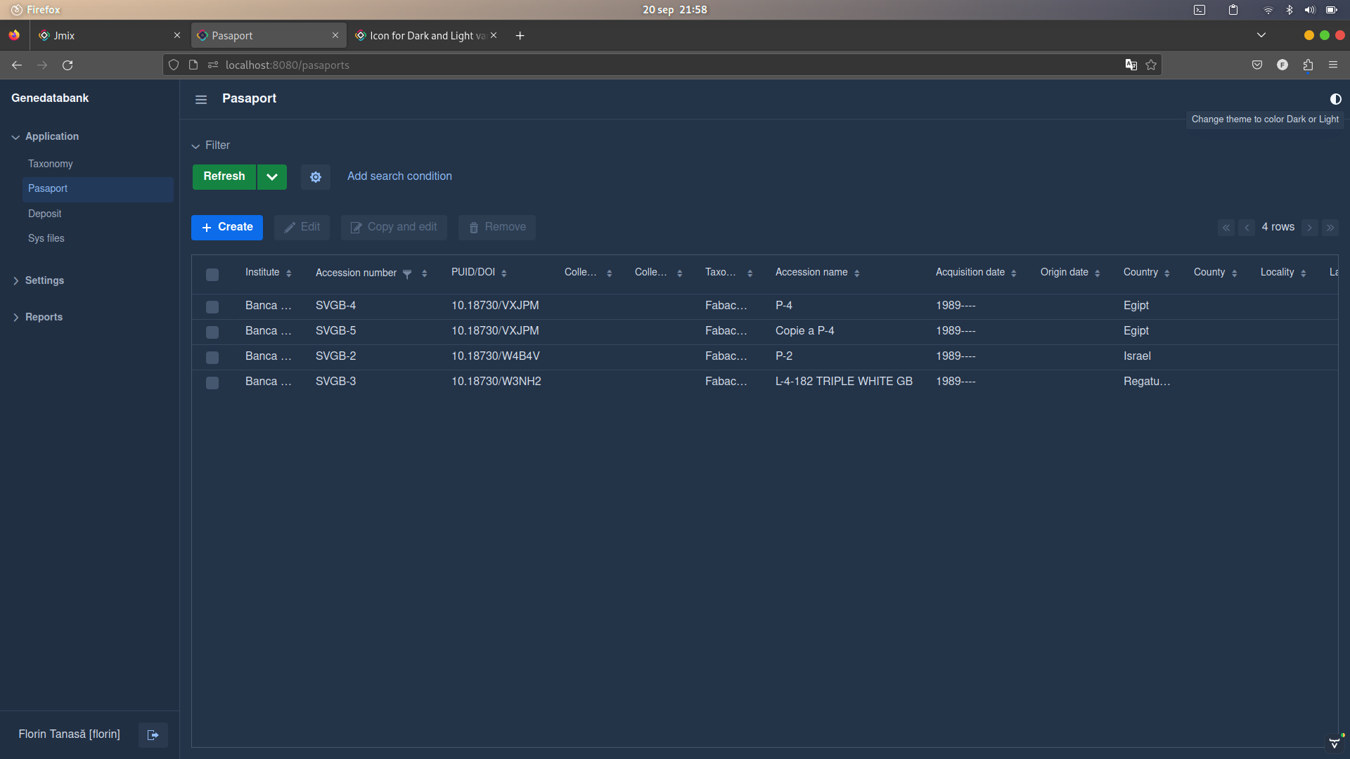
The used icon is VaadinIcon.ADJUST rotated on 180 degree:
private Icon getDefaultIcon() {
    Icon icon = VaadinIcon.ADJUST.create();
    icon.getElement().getStyle().set("rotate", "180deg");
    return icon;
}
To place the button at the end of the header section, you need to add the following class names: ms-auto me-s, e.g.:
<header id="header" classNames="jmix-main-view-header">
    <drawerToggle id="drawerToggle"
                  classNames="jmix-main-view-drawer-toggle"
                  themeNames="contrast"
                  ariaLabel="msg://drawerToggle.ariaLabel"/>
    <h1 id="viewTitle" classNames="jmix-main-view-title"/>

    <button id="themeToggleButton" icon="ADJUST" classNames="ms-auto me-s"/>
</header>
ms-auto effectively means margin-inline-start: auto, i.e. defines the logical inline start margin of an element, which maps to a physical margin depending on flex-direction ; me-s effectively means margin-inline-end: var(--lumo-space-s), i.e. defines the logical inline end margin of an element.
See doc: Layout Rules :: Jmix Documentation .
Regards,
1 Like
Thank you Gleb,
and the code:
package com.genebank.genedatabank.view.main;

import com.vaadin.flow.component.UI;
import com.vaadin.flow.component.button.ButtonVariant;
import com.vaadin.flow.component.html.Header;
import com.vaadin.flow.component.icon.Icon;
import com.vaadin.flow.component.icon.VaadinIcon;
import com.vaadin.flow.dom.ThemeList;
import com.vaadin.flow.router.Route;
import com.vaadin.flow.theme.lumo.Lumo;
import io.jmix.flowui.UiComponents;
import io.jmix.flowui.app.main.StandardMainView;
import io.jmix.flowui.kit.component.button.JmixButton;
import io.jmix.flowui.view.*;
import org.springframework.beans.factory.annotation.Autowired;

@Route("")
@ViewController("MainView")
@ViewDescriptor("main-view.xml")
public class MainView extends StandardMainView {
    @Autowired
    private UiComponents uiComponents;
    @ViewComponent
    private MessageBundle messageBundle;
    @ViewComponent
    private Header header;

    @Subscribe
    public void onInit(final InitEvent event) {
        initManualThemeChange();
    }

    protected void initManualThemeChange() {
        JmixButton themeChangeButton = createThemeButton();
        themeChangeButton.addClickListener(e -> {
            ThemeList themeList = UI.getCurrent().getElement().getThemeList();
            if (themeList.contains(Lumo.DARK)) {
                themeList.remove(Lumo.DARK);
            } else {
                themeList.add(Lumo.DARK);
            }
        });
        header.add(themeChangeButton);
    }

    protected JmixButton createThemeButton() {
        JmixButton themeButton = uiComponents.create(JmixButton.class);
        themeButton.setIcon(getThemeIcon());
        themeButton.addThemeVariants(ButtonVariant.LUMO_CONTRAST, ButtonVariant.LUMO_TERTIARY_INLINE);
        String toolTipThemeButton = messageBundle.getMessage("toolTipThemeButtonMessage");
        themeButton.setTooltipText(toolTipThemeButton);
        themeButton.addClassName("ms-auto");
        themeButton.addClassName("me-s");

        return themeButton;
    }

    private Icon getThemeIcon() {
        Icon icon = VaadinIcon.ADJUST.create();
        icon.getElement().getStyle().set("rotate", "180deg");
        return icon;
    }
}