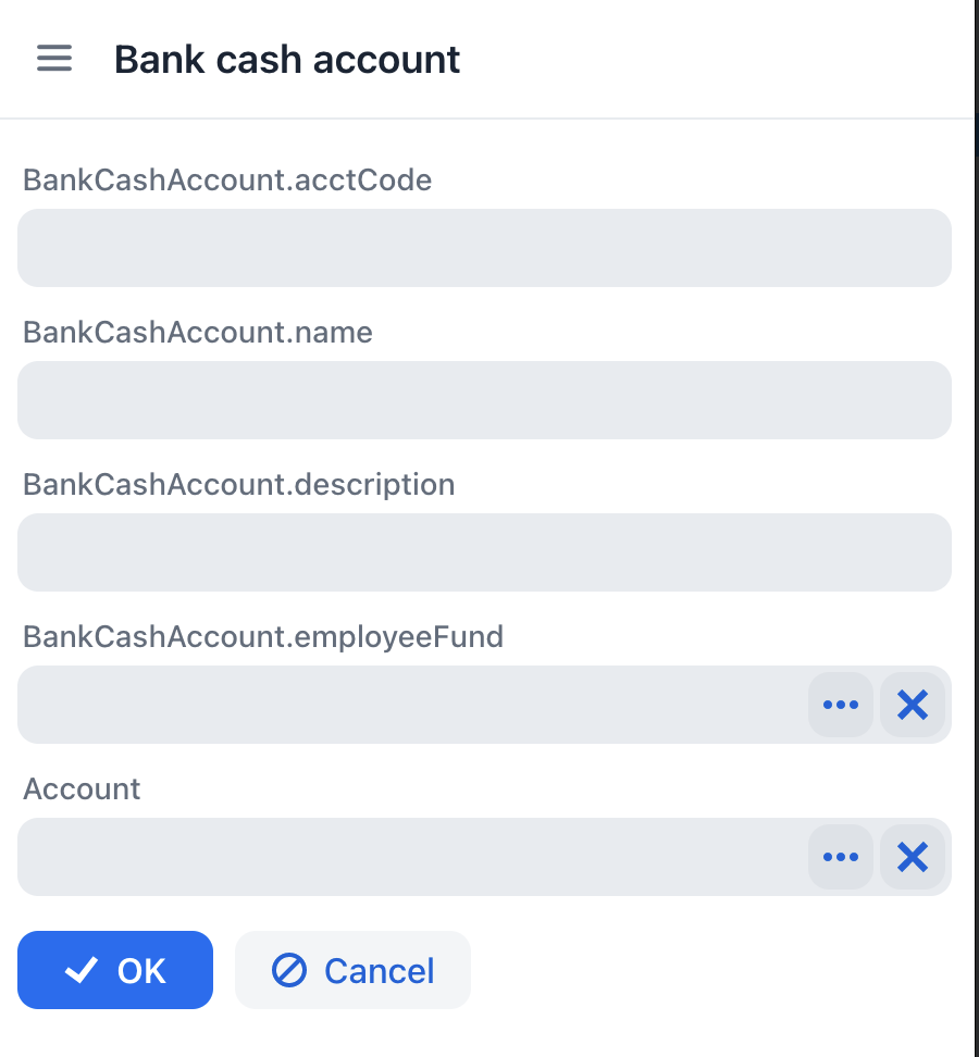
Hi there,
It would be good if petclinic and akkount-jmix example were also released in FlowUI version.
Apart from my feedback during I converted a small project from jmix 1.3 to 1.4RC above, I have tried creating a composite project with flow UI add-ons and here is the feedback:
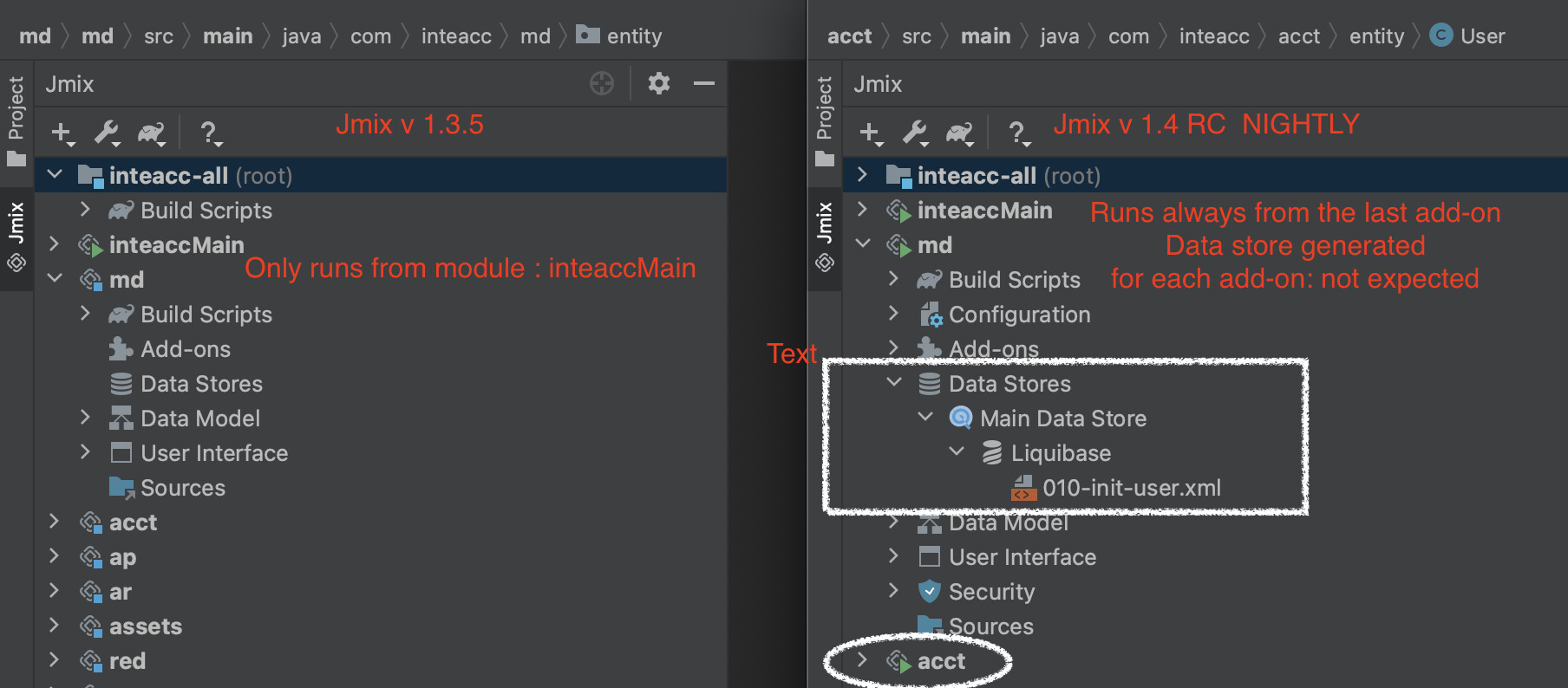
As you see in the image, in v 1.3x only the first add-on created has a green play icon, which indicates (as well as works that way) this is the main module where the menu of this module shows when I run it. Dats store is also active and defined here. On the contrary, in v. 1.4 NIGHTLY, each and every module I add, each of them has their own data store that I don’t want and always the last module runs when I run it.
Moreover, I don’t see option to select dependencies between sub-projects in v 1.4 SNAPSHOT project version anymore.
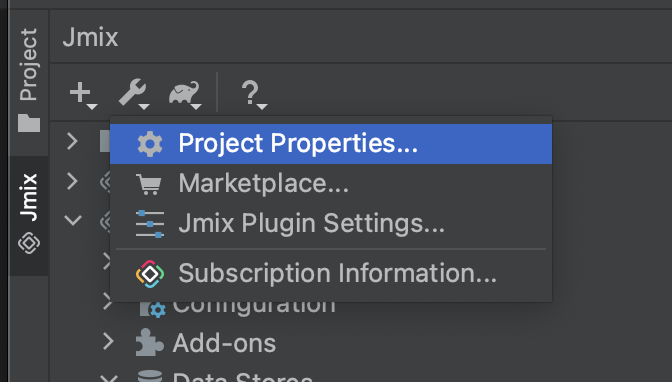
io.jmix.flowui.view.View#addAfterCloseListener should be public, otherwise I can’t add a close listener from the place where I create my view. This was public before.
Is there already a replacement for fragments?
Hi guys,
Thank you for the feedback!
I’ll try to answer some of your questions:
The DataGrid component is very different from classic UI tables, so please do not expect the same API and functionality. See the available methods and description in the Vaadin docs.
That’s correct, the “commit” term has been replaced with “save” in FlowUI.
Correct, use the ValidationEvent handler.
See Javadocs on the Notifications bean.
Created issue: https://youtrack.jmix.io/issue/JST-3351
Created issue: https://youtrack.jmix.io/issue/JST-3352
Yes, it loads the entity by id. You can also see it in XML.
Please check that you are using @ViewComponent annotation to inject components, not @Autowired.
Could you elaborate?
See Views :: Jmix Documentation
It’s not yet ready for FlowUI. Removed from Marketplace in the latest Studio builds.
Will be implemented later.
Sure, we’ll do it.
Created issue: https://youtrack.jmix.io/issue/JST-3353
You can add a close listener only when you open the view in a dialog window. And then you can do it using the addAfterCloseListener() method of the window, see Views :: Jmix Documentation
No. Most probably we will end up using composite components.
(1) In Vaadin there exists the “Upload” component - is it already possible to include our own custom components (or “native” vaadin componentes in this case) in the view descriptors?
Some more questions:
(2) BackgroundWorker, BackgroundTask - are there already replacements?
(3) ResponsiveGridLayout ?
Yes, you can use ANY Vaadin component as if you were building a plain Vaadin application. An example for file uploading:
@ViewComponent
private FormLayout form;

@Autowired
private FileStorage fileStorage;

@Subscribe
public void onInit(InitEvent event) {
    MemoryBuffer memoryBuffer = new MemoryBuffer();
    Upload upload = new Upload(memoryBuffer);
    upload.setMaxFiles(1);
    upload.addFinishedListener(event1 -> {
        FileRef fileRef = fileStorage.saveStream(memoryBuffer.getFileName(), memoryBuffer.getInputStream());
        getEditedEntity().setPicture(fileRef);
        updateImage();
    });
    form.add(upload);
}
Will be implemented later.
Use Form Layout
Will the BPM add-on Input dialogs in Jmix 1.4 use the Flow UI, or is it planned for 2023-02?
Thanks
Ok, thanks, is it also already possible to define a custom component for usage in the view descriptor xml? So I could make a e.g. <myapp:myupload id="testUpload" /> element?
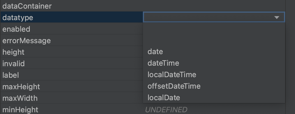
→ for example the column data type attribute in the view XML file can be selected when it is generated. You may also consider default alignment like the right alignment for numbers.
ResponsiveSteps setting worked like a charm when defined from controller but it doesn’t work when setting from the xml file.
            <responsiveSteps>
                <responsiveStep columns="1" minWidth="0"/>
                <responsiveStep columns="2" minWidth="420"/>
                <responsiveStep columns="3" minWidth="600"/>
                <responsiveStep columns="4" minWidth="950"/>
                <responsiveStep columns="5" minWidth="1250"/>
            </responsiveSteps>
Theme:
I didn’t come across any option to select of use of customized theme.
- I expect there will be options in the final version
- In Vaadin, there is a theme editor which we can download and use in simple steps. How can we do the same in Jmix?

another question: is view extending already possible? (like Extending Functionality :: Jmix Documentation )
Will the BPM add-on Input dialogs in Jmix 1.4 use the Flow UI, or is it planned for 2023-02?
FlowUI for BPM add-on is planned for the next feature release in Feb 2023.
Hi,
Ok, thanks, is it also already possible to define a custom component for usage in the view descriptor xml? So I could make a e.g.
<myapp:myupload id="testUpload" />element?
Sure. The process of registering any UI component is the same as for the classic UI. You need to provide a io.jmix.flowui.sys.registration.ComponentRegistration bean, e.g.:
@Configuration
  public class ComponentConfiguration {

      @Bean
      public ComponentRegistration extJmixButton() {
          return ComponentRegistrationBuilder.create(MyUpload.class)
                  .withComponentLoader("myupload", MyUploadLoader.class)
                  .build();
      }
  }
XSD schema doesn’t require registration.
another question: is view extending already possible? (like Extending Functionality :: Jmix Documentation )
Currently, there is no extend attribute in XML descriptor, so if any view needs to be extended, then you need to override it by providing a view with the same Id.
Regards,
Gleb
Hi,
ResponsiveSteps setting worked like a charm when defined from controller but it doesn’t work when setting from the xml file.
The ResponsiveStep's minWidth attribute works absolutely the same in XML and Java code as we simply pass minWidth value from XML to the ResponsiveStep constructor without modifications. For proper work of minWidth the size unit must be defined, except 0. We do not plan to alter XML loader logic (e.g. adding default unit size) because it must be the same as Java code.
Theme:
I didn’t come across any option to select of use of customized theme.
- I expect there will be options in the final version
- In Vaadin, there is a theme editor which we can download and use in simple steps. How can we do the same in Jmix?
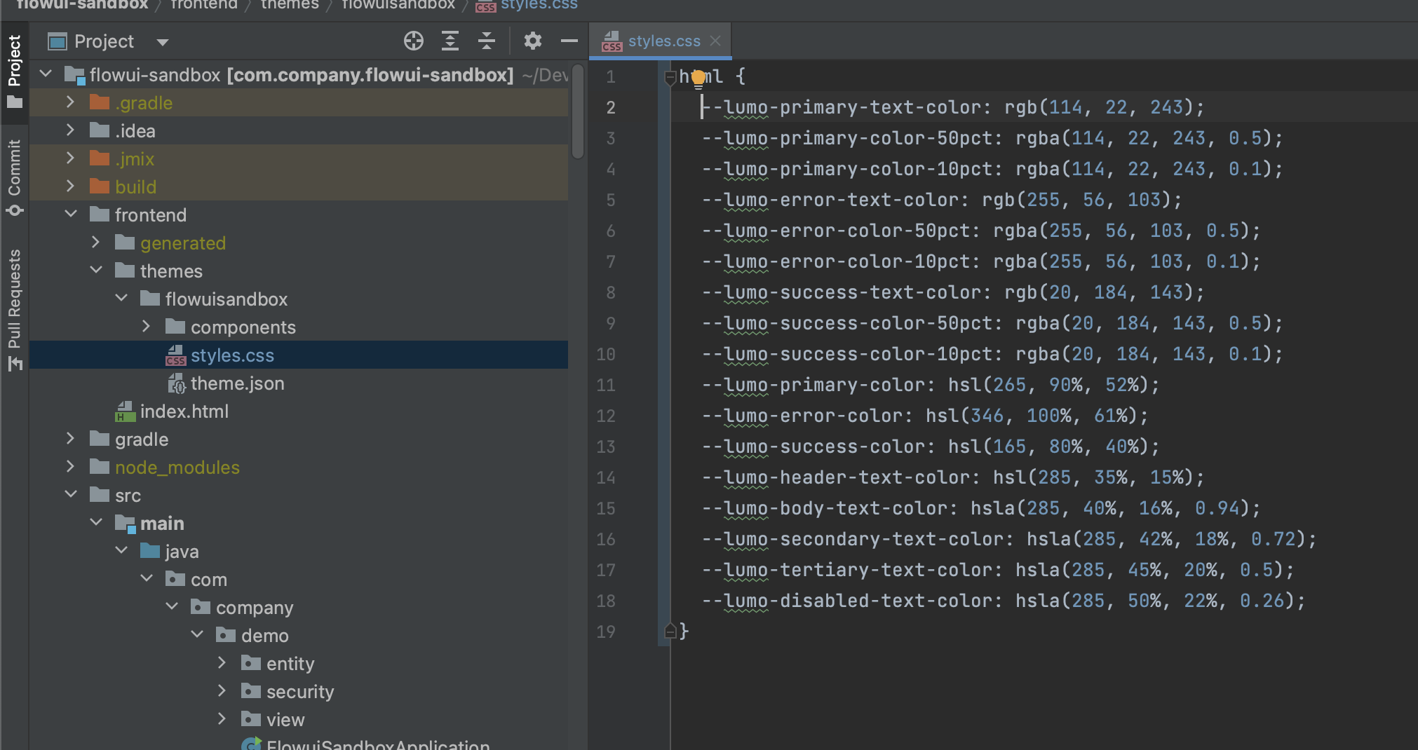
A newly created project already contains extended theme under <root>/frontend/themes/<theme_name> directory. That means that any output from Vaadin Lumo Editor can be easily applied to the Jmix Application, just copy generated code to the style.css file, excluding HTML tags, e.g.:
Regards,
Gleb
or example the column data type attribute in the view XML file can be selected when it is generated.
Could you please describe in more detail? I still don’t get the problem.
You may also consider default alignment like the right alignment for numbers.
We do not plan adding default alignment. if it is needed the alignment can be easily changed using:
-
themeNames="align-right"for input fields -
textAlign="END"for DataGrid columns
Thank you Gleb.
I tried to use Vaadin lumo editor generated styling codes as follows
inteaccpf.css
/* Define your styles here */
<custom-style>
  <style>

    html {
      --lumo-space-xl: 1.875rem;
      --lumo-space-l: 1.25rem;
      --lumo-space-m: 0.625rem;
      --lumo-space-s: 0.3125rem;
      --lumo-space-xs: 0.1875rem;
    }

    [theme~="dark"] {
    }

  </style>
</custom-style>
and getting the following errors-
Webpack Error Close

No issues were found.

WARNING in InjectManifest has been called multiple times, perhaps due to running webpack in --watch mode. The precache manifest generated after the first call may be inaccurate! Please see https://github.com/GoogleChrome/workbox/issues/1790 for more information.

ERROR in ./themes/inteaccpf/inteaccpf.css (../node_modules/.pnpm/css-loader@5.2.7_webpack@4.46.0/node_modules/css-loader/dist/cjs.js??ref--5-2!../build/plugins/theme-loader/theme-loader.js??ref--5-3!./themes/inteaccpf/inteaccpf.css)
Module build failed (from ../node_modules/.pnpm/css-loader@5.2.7_webpack@4.46.0/node_modules/css-loader/dist/cjs.js):
CssSyntaxError

(16:3) /Users/mak/Projects/inteaccpf/frontend/themes/inteaccpf/inteaccpf.css Unknown word

  14 |     }
  15 |
> 16 |
     |   ^
  17 |
  18 |
As I mentioned above, you have to exclude HTML tags from generated code, i.e.
<custom-style>
  <style>
and
  </style>
</custom-style>
are not CSS code and must be removed.
Thank you Gleb, removed the tag and now it’s running. I see the radius has been changed as expected but the dark theme is not working, always showing the light theme.
html {
  --lumo-border-radius: 0.6em;
  --lumo-space-xl: 1.875rem;
  --lumo-space-l: 1.25rem;
  --lumo-space-m: 0.625rem;
  --lumo-space-s: 0.3125rem;
  --lumo-space-xs: 0.1875rem;
}

[theme~="dark"] {
  --lumo-base-color: hsl(214, 87%, 12%);
}
Output of theme (not a dark theme!)
