I’m trying to create a stacked bar chart with non-entity data programatically.
This would probably mean using multiple bar series. The documentation is not sufficient and confusing.
eg, how do multiple barseries fit in a single dataset.
It tried using the AI assistant. I already have more than 10 conversations, the answers are plain out wrong, and I encounter lots of hallucinations referring to non-existant classes and methods.
If I get it working Ill provide an example of my own for future reference in this thread.
I have a code example that might help you, however it is not a production ready solution, but it is better than nothing.
Here is the project i prepared when implementing the Charts Add-on.
In this project you can find the implementation of programmatic adding and removing bar series in the chart component.
Thanks for the reply but still not sufficient for me
In your example the structure of the data is still static. Your TransportCount class is known before and you only have 3 categories
cars
motorcycles
bicycles
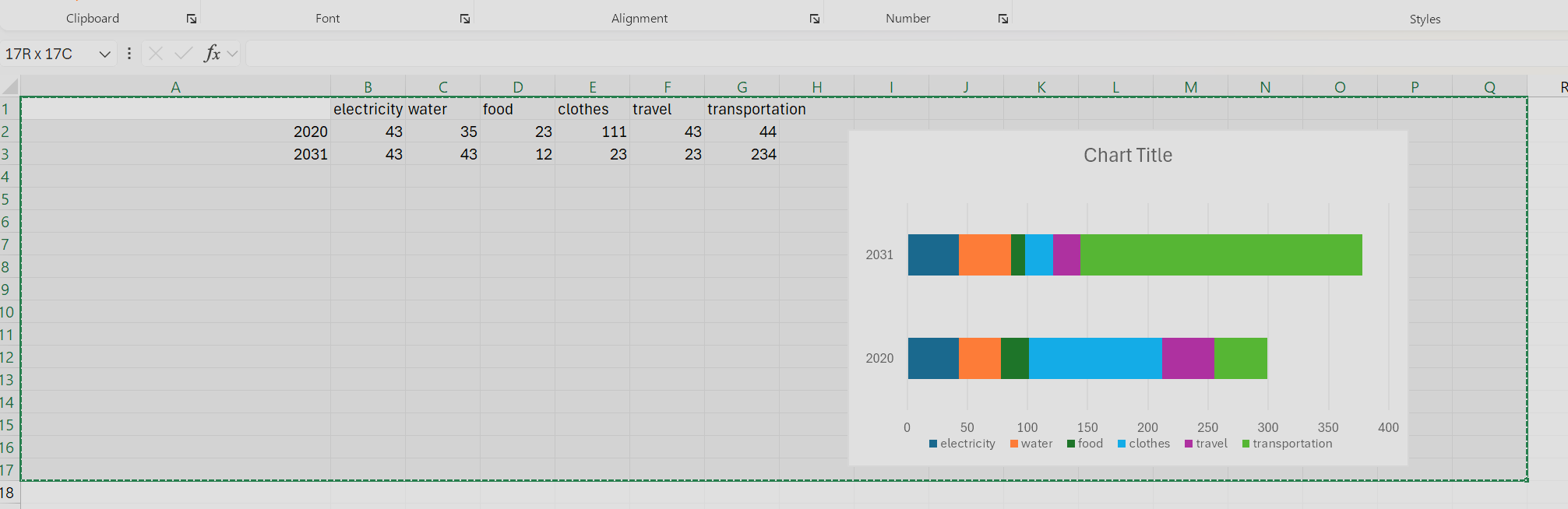
In my case, those categories are entered by the user. consider something like following screenshot. I basically get cost data from many external sources. Each entry in the cost data has a code that means something in an external system. I then aggregate it according to time period and code.