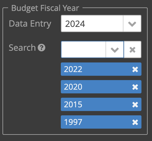
Are there any plans to include the tagPicker UI component in Jmix 2? There doesn’t appear to be anything that provides the same user experience that is available in Jmix 1.
The closest component I can find is multiSelectComboBoxPicker, but it doesn’t offer the same experience. With TagPicker, the user can both view all the selected values and remove them individually without having to scroll through a long dropdown. This is particularly useful when using multiple tag pickers.
As I migrate from Jmix 1, I may have to resort to using multiSelectComboBoxPicker. However, I feel like we’ve lost a very useful UI component.
multiSelectComboBox and multiSelectComboBoxPicker are replacements for TagPicker with just different placements for selected items (inside field instead of outside of it). If multiSelectComboBox is big enough, you can remove items by clicking the x button, e.g.:
For now we don’t plan to implement a TagPicker component.
Thanks for the fast response. I had only adjusted height, not width, and did not see that the behavior of multiSelectComboBoxPicker is more similar to tagPicker than I realized.
Do you know if there is any way to configure a vertical orientation? Even with a fixed height, I have use cases where I’d like to list the options vertically, such as in the left navigation bar. It would be nice to allow space for, say, 5 options, before the overlapping behavior appears.
Thanks, Gleb! I didn’t think to look at the Vaadin documentation. It appears they recently added an “auto expand” feature in v24.3 that works both horizontally and vertically. Hopefully this can be integrated into Jmix in the future. From the documentation:
The component can be configured to auto-expand in order to accommodate chips for selected items. It is possible to expand both horizontally (until max-width is reached) and vertically (in which case the field with chips wraps in multiple lines). These modes can be also used together. comboBox.setAutoExpand(AutoExpandMode.BOTH);
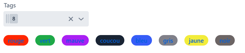
Hi, I just started to use JMIX. I wanted also to use some sort of “tags”. So I used the multiSelectComboBox. But I can’t set the color of the tags, so I’m also showing a span below the multiselect to display the tags in pill & color format. It will be nice to have this build in.
Also, we need a more generic solution. i.e. I need to set tags over +30 entities. I was able to create a relatively general solution but still have to configure few things on each entity the make it workable.
We obviously cannot make everything built-in. You could try to create your own composite component or fragment to not duplicate code across many views. Let us know if you have trouble with this.